A scalable website architecture
for property management at regional scale.

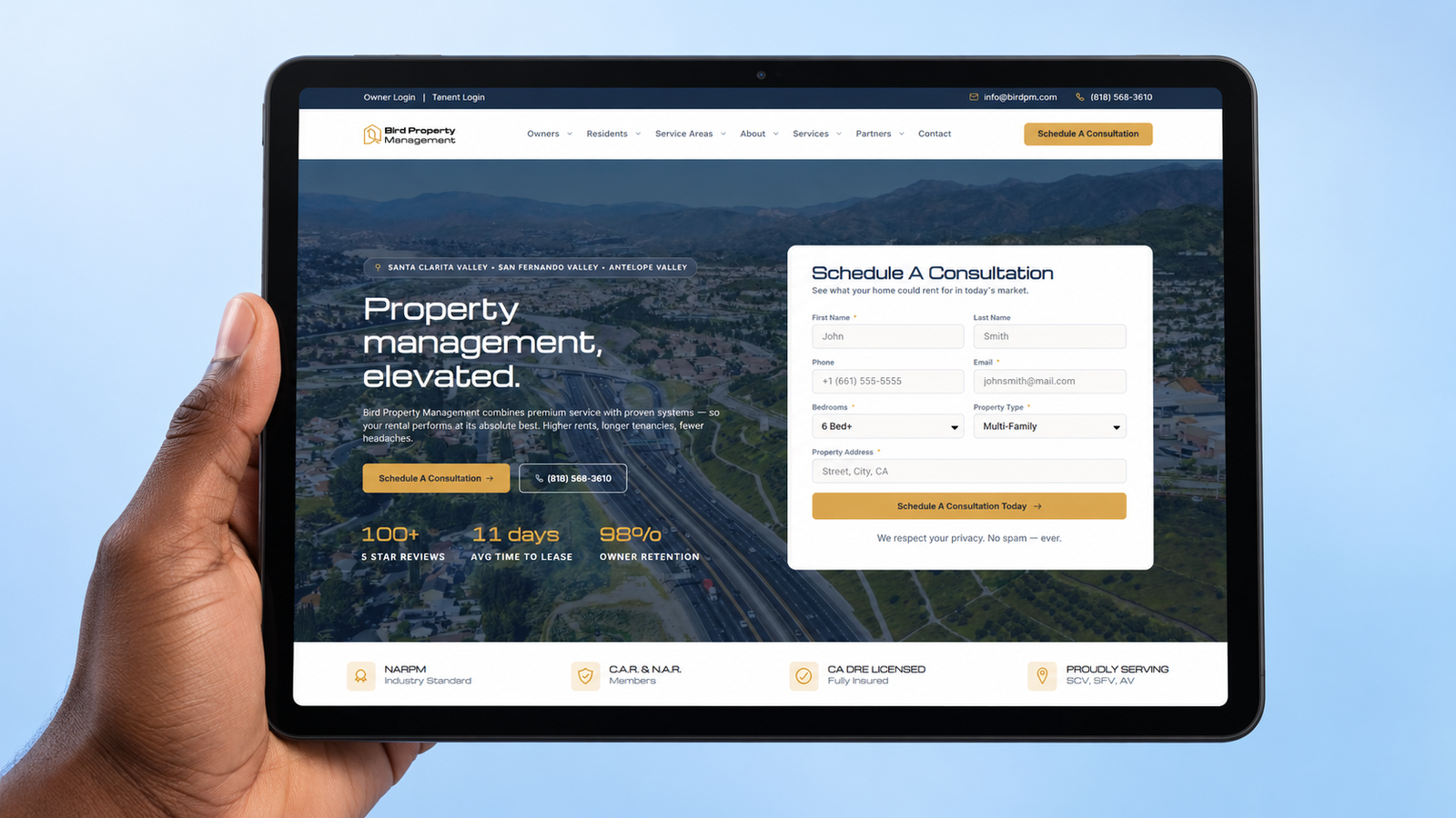
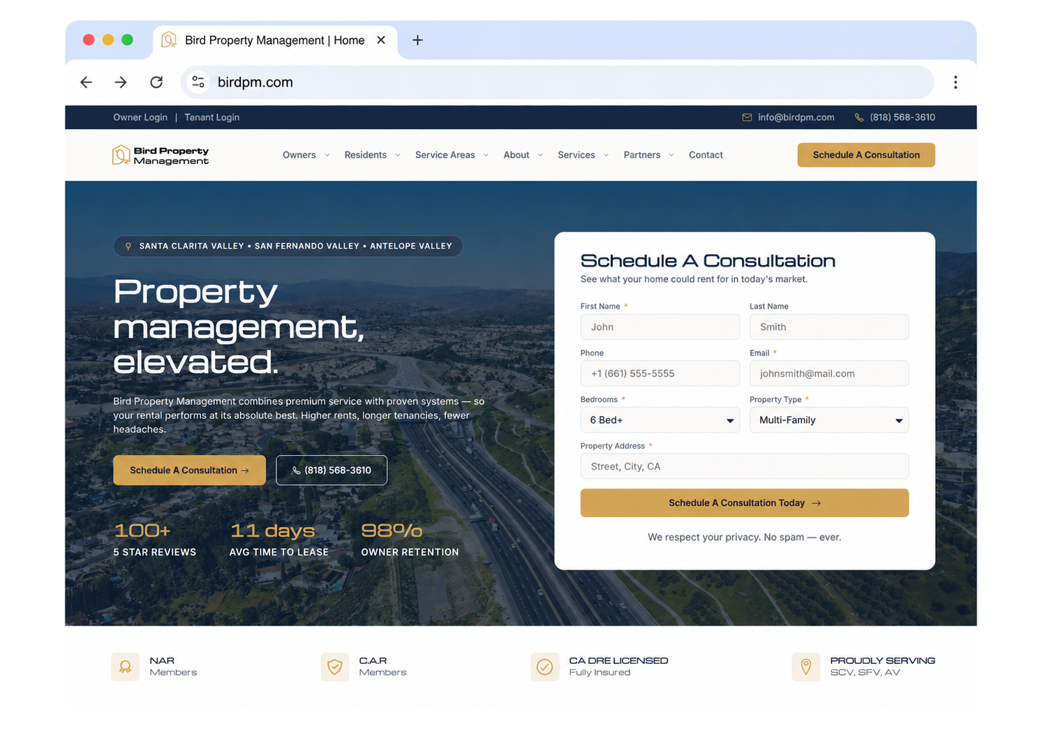
Bird Property Management runs rental portfolios across the San Fernando, Santa Clarita and Antelope valleys. Built on WordPress with Elementor Pro, the site carries eighty pages organised around where Bird operates and who is reading — owners, residents and referral partners — with the Rent Manager owner and tenant portals wired in under Bird’s own domain

48

City pages. Every market addressed on its own page, not listed as a line in a coverage area.

3

Audience journeys. Owners, residents and referral partners kept separate from the navigation down.

2

Client portals. Owner and resident access running under Bird’s own domain, not a stranger’s login.

The project at a glance

A service platform for a property management firm that sells to owners, serves residents, and recruits referral partners, built so all three can be handled well at the same time.

Client

Bird Property Management, managing residential rental property across the San Fernando Valley, the Santa Clarita Valley and the Antelope Valley.

Website type

Property management marketing website with a structured service area system and integrated owner and resident portals.

Market covered

The San Fernando Valley, the Santa Clarita Valley and the Antelope Valley, across forty-eight named cities.

Audience

Rental property owners, current residents, and the agents, loan officers, financial planners, CPAs and investors who refer work.

Platform

Built on WordPress with Elementor Pro, so a new city or service page is published by the client rather than commissioned from a developer.

Management software

Rent Manager owner and tenant portals, integrated under Bird’s own subdomains rather than linked out to a vendor address.

Our scope

Strategy, UX and information architecture, UI design, full development, portal integration, and local SEO structure.

Three audiences, one website, and none of them alike

A property manager is selling to one group, serving a second, and recruiting a third. Most sites in this category write one set of pages and hope everybody finds themselves in it.

Problem 01

Owners and residents want opposite things

An owner is reading a pitch about returns. A resident is trying to pay rent or report a leak. Put them on the same page and the copy speaks to neither.

Problem 02

A coverage list wins nothing

Naming forty-eight cities in a paragraph ranks for none of them. An owner searching for management in their own city will never find a sentence buried on an about page.

Problem 03

The software lives somewhere else

Rent Manager runs the portfolio, but it is a separate system. Residents sent to an unfamiliar login at the moment they are paying rent lose confidence in the brand.

And a positioning problem on top. Bird sells a premium, systems-driven service, not the cheapest management fee in the valley. The website had to make that visible before the pricing conversation, or every enquiry starts as a price comparison.

What the client required

A premium, institutional presentation

A brand that reads closer to a wealth management firm than a letting agency, because the pitch is stewardship of an asset.

Real coverage of every service area

Each city addressed as its own market, so an owner in Palmdale and an owner in Studio City both find a page written for them.

Separate paths for owners and residents

A sales journey for one, a task-led service journey for the other, without either passing through the other’s content.

Owner and tenant portal access

Both logins reachable from anywhere on the site, and hosted under Bird’s own domain so the handoff feels continuous.

A referral program with its own pages

Agents, loan officers, planners, CPAs and investors each need a different reason to send work, and each needed somewhere to land.

A structure the team can extend

New cities, services and articles added in-house without commissioning development work each time.

Our approach, and what we built

We mapped the owner’s journey from first doubt to signed client, then built a page type for each step of it. That map decided the whole information architecture.

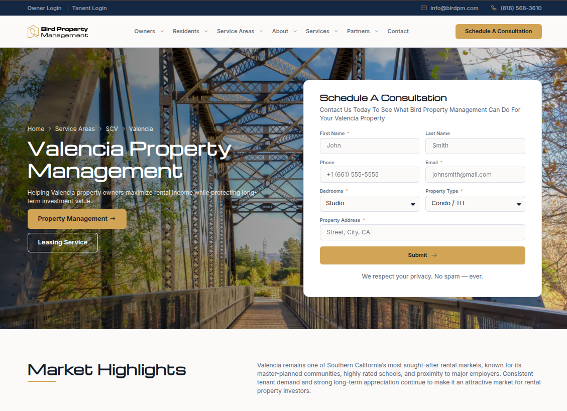
Valencia

The Santa Clarita core.

Master planned neighborhoods and the highest concentration of managed doors.

Woodland Hills

The west Valley edge.

Where the San Fernando Valley meets the hills, and rents step up with it.

Van Nuys

Dense, central, always leasing.

High turnover and steady demand, the workload that proves a management system.

Palmdale

The Antelope Valley reach.

Desert edge inventory an hour north, and the reason the map runs to three valleys.

+42 more

The service area system

Forty-eight cities, three regions, one template

Bird has no property search to build, so the structured system at the centre of this project is geographic. We designed one city layout and built forty-eight markets on it, each running the same sequence: the city named in the heading, a consultation block, a market opportunity section, separate blocks for owners and referral partners, testimonials and recent insight.

Cities sit under their region rather than at the root, which keeps the whole set navigable from a single menu and means a new city is added inside an existing structure instead of bolted onto the end of a list.

Three audiences, never mixed

A sales journey, a service journey, and a partner journey

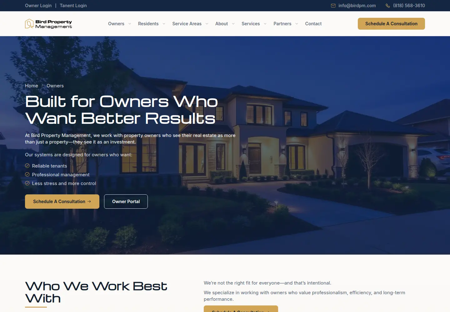
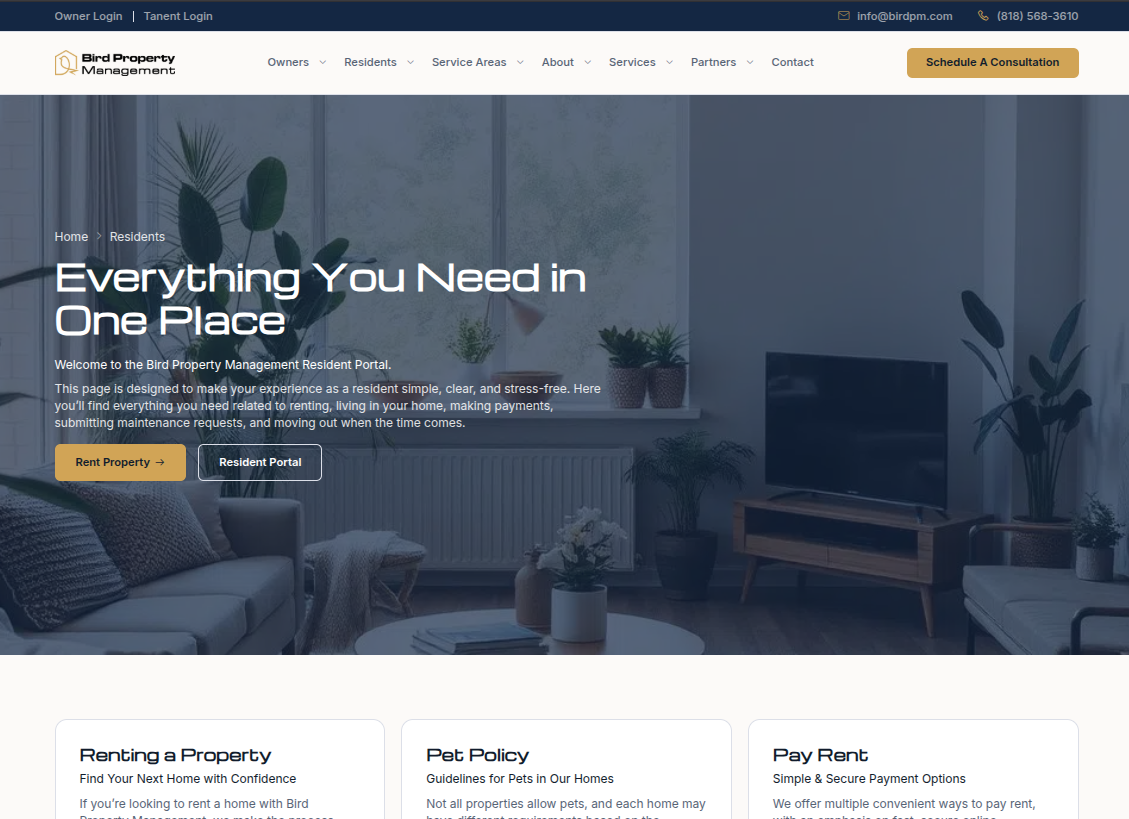
We split the site at the top level. Owners get service tiers, the onboarding sequence and a consultation booking. Residents get six task pages, each doing one thing: pay rent, request maintenance, understand the pet policy, move out. Referral partners get their own track with a page per profession.

The owners section also names who Bird is not a good fit for, which is unusual to publish and is exactly what makes the rest of the pitch credible.

Built to be found

An address that says where you are

Every page sits at a path that carries its own hierarchy, so a visitor and a search engine can both read position from the address alone. A city page knows it belongs to a region, and a resident task page knows it belongs to the resident track.

Each page carries its own title and description, and the site publishes a local business profile so search engines know exactly which firm, which license and which service area they are looking at.

Typography and colour

A single-weight display face against a full-range grotesque, and a fourteen-value palette defined once in the Elementor global kit.

Michroma

Display

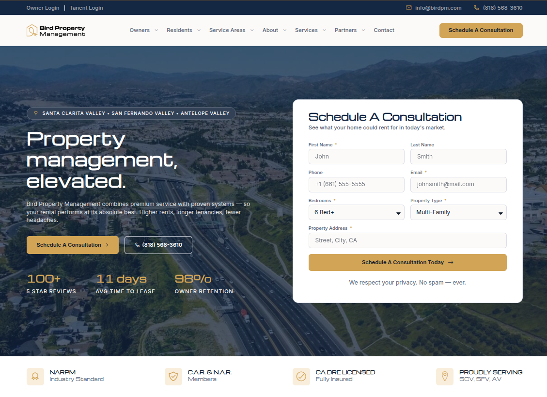
Property management, elevated.

San Fernando  ·  Santa Clarita  ·  Antelope Valley

Inter

Body and interface

Bird manages residential rental property across three Southern California valleys, for owners who want the asset handled rather than the day handled.

Inter carries everything Michroma cannot: body copy at 400, interface labels at 500, buttons and section labels at 600. Four weights on the body face compensate for having none on the display face.

Schedule a consultation

#142743

Navy — primary

#000066

Deep blue — secondary

#403C33

Gold — accent

#576375

Slate — body text

#111C2C

Ink — dark surfaces

#FCFAF8

Warm white — ground

Owner and resident portals, under Bird's own domain

The marketing site and the management software are different systems with different jobs. The work was routing each visitor to the right one without the handoff feeling like leaving.

Bird runs its portfolio in Rent Manager, which provides separate owner and tenant web access. We integrated both under Bird’s own subdomains and surfaced them from the site header on every template, so a resident paying rent and an owner checking a statement each reach their own system immediately.

Each portal also has a page on the site before the handoff, which is where the explanation lives: what the portal does, what to do if a login fails. The software itself cannot host that copy, and without it every failed login becomes a phone call.

Owner access

for statements, reporting and portfolio visibility, reached from the Owners menu and the header.

Resident access

for rent payment and maintenance requests, sitting at the end of six task pages that each do one thing.

Branded subdomains

so the visitor never lands on an unfamiliar vendor address at the moment they are entering payment details.

A drawn boundary

 between the two systems. Nothing the management platform already does well was rebuilt in WordPress.

Serving several audiences from one website?

Then one set of pages will not do it. We separate the journeys, build the location architecture as a system rather than a list, and integrate the software you already run instead of rebuilding it — on WordPress, handed over working